project 2: networking.
for the next few weeks i will be working with 3 second years to come up with a way of making our self's more employable via the means of social networking sights and the web.
initial ideas include:
holding a creative event sending info via the web.
create a online portfolio to show off work to a wide audience.
creative site with regular updates and ways to get involved.
get some publicity through the press in some way.
chain mail of work, sent everywhere to gain maximum views.
ill let you know how it goes.
31.1.10
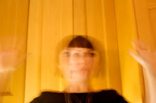
darrent drawing workshop

so at first i was a bit skeptical but at the end of the session i was converted. drawing with the wring hand and with out looking DOSE create some lovely imagery.

so in reverse. this was mt final image, 'drawing with paper' and then drawing details without looking at the paper. the things i like about this image is the freedom and craft look , the contrasting paper creates a crisp clean look and the fussy messy pencil mixes well with this. i would however quite like to go back over the drawing with a pen and able to actually look at what im doing.

this was my second to last image. drawing with the wrong hand and not looking, with text over the top. ( i cant spell anyway but not being able to see what im doing seams to increase this problem). i think the main thing that makes there images work is that the subject, text and drawing style all tie neatly together , there all young and playful.

this was my first drawing. a normal style of drawing were by looking at the paper and using my right hand. then when i was told not to look at the paper and to use the wrong hand i thought the out come would b horrid and i came to the lesson to create 'better' drawings after all. but the looking and comparing my first drawing with the last i would completely agree.
the first drawing is stiff and the expression and feel of the character is a bit unsure and uptight, just like my drawing style.
in comparison to my final two images which show much more playful and happy characteristics.
a very insightful lesson.

and here was my muse, Robby the robot.
i hope to make him famous my creating some screen prints.
There images show my paper craft people that were made for my magazine campaign.
the images were meant to be striking and simple with a craftelement which would very simply introduce the idea of a new magazine coming out in the future. as a sort of taster of whats to come. I am pleased with the outcome.

I think they are strong images. if i was to be very critical i would say that after doing my research this is not the typical genre of imagery used to appeal to the 50-65 ages, however new is always good. why copy existing styles when im trying to be new and innovative.


6.12.09

you cant see it very well here, click it to enlarge..
This image is my final piece for my first project, it is inspired mt stina persson
the image is made from paper ribbon and a button, the small text was added using photo shop.
I am very pleased with the outcome.
she remains faceless as i wanted her to appeal to a mass audience, people will hopefully be able to use there imagination and create there ideal character.
I want to make a few of these, with different charectors.
25.11.09


when i retire i want to be...
this is a idea i have for the magazine campaign.
inspiring retired people to follow there childhood dreams, if they have spent the last 20years as a lawyer but always dreamed of being a rock star, take up guitar lessons. take up writing, rock claiming, anything.
this image was found on google images
possible logo or ad for my magazine...
it ticks all the right boxes, simple, recognizable and relates to my target audience, a bit of word play, eye catching and bold, yet i think its a bit naff.? improvment? i feel it needed aging . although it has been around for so long and has all the characteristics of a old sign, if is so often used that it has remained current so it is not seen as a vintage sign.

it ticks all the right boxes, simple, recognizable and relates to my target audience, a bit of word play, eye catching and bold, yet i think its a bit naff.?
 improvment? i feel it needed aging . although it has been around for so long and has all the characteristics of a old sign, if is so often used that it has remained current so it is not seen as a vintage sign.


Derick the deer

this is Derick...
he is made up of 69 a6 collages that look a bot lost on there own but when put together make lovely Derick.
he is made up of shopping bags, news paper, magazines, boxes, music paper and a few other bits and bobs, and he took ages to make.
I tried to to a stock image film of how i made him but due to the camera moving and zoom changing , the out come wasnt so fantastic, still practice makes perfect.


vintage magazines and adverst.

i have gathered a few examples of vintage,
i want my magazine to appeal to that age group and i want it to have a home made craft feel.
i have now decided that the magazine will be created by the readers,
retired professionals, are inteligent and have a lot of like on there hands, they are also the ones eho know best what they want to read so who better to create a magazine!

The big idea
my main hurdle was to fined a way to link my client ,message and target audience.
charity is charity, the message is clear, its the recently retired profs that are the issue, they have no really need for help from a charity , there for it would have to be the reverse and convince them to get involved with a charity, at the same time as making them more confident.
so i propose making a product that would appeal to my audience, which helps them to become more confident at the same time as making money for a charity, which they would be interested in helping.
... a inspiring magazine aimed at 45+ professionals, all profits will go to a charity aimed to help the elderly. genius.
Graphic Design Fundimentals project
my client : a charity
my message : be more confident
my target audience: recently retired professionals
my message : be more confident
my target audience: recently retired professionals
13.10.09
Sara Fenelli

in my opinion sara has created some of the most beautiful and imaginative collages out there, she uses collage as a method of illustration for childrens books, but sh has gone on to have her own show at the tate and work with many big company's to create art work in campaigns and promotions.
 she is also very creative with her language and has created some of my most lived my and favorite phrases.
http://www.sarafanelli.com/docs/bg02.html
Rebus transfer
this is when image is used to communicate language . this image is a simple example.
i like the way it forces the viewer to think about the image and text , more then if it was just plain text. in this way it is interactive and adds interest.
i like the way it forces the viewer to think about the image and text , more then if it was just plain text. in this way it is interactive and adds interest.

9.10.09
Dali's harts elephant and calste
 could this be Dali's interpretation and contribute to our grate elephant and castle? this is one of the many sculptures by Salvador Dali that is now being displayed along the banks of the themes, it makes for a interesting view and i love to see art out in the open for everyone to enjoy. i encourage everyone to go take a look.
Subscribe to:
Posts (Atom)